源码解析 Table (Ant-Design) 触发 Shift 批量选择
虽然这是一篇关于 Ant Design Vue(v1.7.7) 的记录文章,但其实是在使用 Naive UI(v2.16.7) 途中发现的一个有趣的小细节。 正在翻看 Naive UI 的时候,发现了一篇关于表格批量选择的 Issues(👀查看 )。 思路也很好理解: 在 Antd 中对应的源码为: 计算 位置方向(正数、负数、零) = (起始位置 - 触发Shift按键的选择项位置) 的值 const direction = Math.sign(pivot - realIndex); 计算 距离差值 = (起始位置 - 触发Shift按键的选择项位置) 的距离 const dist = Math.abs(pivot - realIndex); 计算 当前循环选择的位置 = 触发Shift按键的选择项位置 + 进步方向的值(步数 * 方向) const i = realIndex + step * direction; 批量选择、取消选择都是以 下面这段是 Antd 组件 Table 中选择相关(普通勾选、触发 Shfit 批量勾选)的核心源码(👀查看完整源码 )。 我这里大致为源码写上注释便于理解(由于个人理解可能存在偏差,如有误欢迎指正~) 结合 Table 组件的源码思路,我们可以在 Antd 的 CheckBox 组件中实现 Shift 批量选择,并在思路的基础上加入预选择项提示(能够让用户感知他所正在操作的选项)。 在实际项目使用中,为了多选功能让用户感知并使用,也可以在UI上模拟常用的系统文件夹或者Excel的风格提高暗示性(来源leadwhite的建议) 实现方式都在注释中… 【1】https://github.com/vueComponent/ant-design-vue
转载请遵循
在 Antd 的 Table 表格组件中多选框按住 Shift 能够进行批量选择(类似 Excel 中 Shift 的多选用法)。

思路
操作的范围
首先记录两个值:选择项起始位置 和 触发Shift按键的选择项位置,
最后通过计算这两个值的 方向 和 距离差值 循环赋值 差值的数据,得到操作范围的详细数据。
批量选择、取消选择的时机
当前触发Shift按键的选择项 正在进行的操作为准。
比如:当前触发Shift按键的选择项 正在进行取消选择操作,其他范围内的选项将会批量取消选择。源码解析
handleSelect(record, rowIndex, e) {

  // 当前选择项的状态 true:勾选 false: 取消勾选
  const checked = e.target.checked;

  // 操作事件 可用于查看当前选择项的Shift按键及其它触发状态
  const nativeEvent = e.nativeEvent;

  // 默认选择项
  const defaultSelection = this.store.selectionDirty ? [] : this.getDefaultSelection();

  // 当前已选择项(已选择项 + 默认选择项)
  let selectedRowKeys = this.store.selectedRowKeys.concat(defaultSelection);

  // 当前选择项Key
  const key = this.getRecordKey(record, rowIndex);

  // 起始选择项位置(每一次勾选项的记录值)
  const { pivot } = this.$data;

  // 表格当前页数据
  const rows = this.getFlatCurrentPageData();

  // 当前选择项位置
  let realIndex = rowIndex;
  if (this.$props.expandedRowRender) {
    realIndex = rows.findIndex(row => this.getRecordKey(row, rowIndex) === key);
  }

  // 判断是否触发 Shift按键
  // && 起始选择项位置存在
  // && 当前选择项位置 不同于 起始选择项位置
  if (nativeEvent.shiftKey && pivot !== undefined && realIndex !== pivot) {
    // 满足 触发 Shift 批量选择

    const changeRowKeys = [];

    // 计算 位置方向
    const direction = Math.sign(pivot - realIndex);

    // 计算 起始选择项位置 与 当前选择项位置 的距离差值
    const dist = Math.abs(pivot - realIndex);

    let step = 0;

    // 循环完成距离的差值
    while (step <= dist) {

      // 计算当前循环选择的位置
      const i = realIndex + step * direction;

      step += 1;

      // 当前循环位置的数据
      const row = rows[i];

      // 当前循环位置的Key
      const rowKey = this.getRecordKey(row, i);

      // 当前循环位置选择框的Props
      const checkboxProps = this.getCheckboxPropsByItem(row, i);

      // 跳过当前循环位置为disabled的禁用状态
      if (!checkboxProps.disabled) {

        // 已选择项位置中 是否包含 当前循环位置,如果包含就代表可能需要进行取消选择操作
        if (selectedRowKeys.includes(rowKey)) {

          // 当前选择项的状态
          if (!checked) {
            // 满足 取消选择操作

            // 过滤 当前循环位置 并重新赋值
            selectedRowKeys = selectedRowKeys.filter(j => rowKey !== j);
            changeRowKeys.push(rowKey);
          }
        } else if (checked) {
          // 不满足 包含的情况,则代表可以直接进行勾选

          // 已选择项 赋值 当前循环的位置
          selectedRowKeys.push(rowKey);
          changeRowKeys.push(rowKey);
        }
      }
    }

    // 赋值 起始选择项位置
    this.setState({ pivot: realIndex });
    this.store.selectionDirty = true;
    this.setSelectedRowKeys(selectedRowKeys, {
      selectWay: 'onSelectMultiple',
      record,
      checked,
      changeRowKeys,
      nativeEvent,
    });
  } else {
    // 不满足 触发 Shift 批量选择,则为普通勾选

    // 判断 当前选择项的状态
    if (checked) {
      // 满足 勾选进行赋值
      selectedRowKeys.push(this.getRecordKey(record, realIndex));
    } else {
      // 不满足

      // 取消勾选内容,过滤 当前选择项 并重新赋值
      selectedRowKeys = selectedRowKeys.filter(i => key !== i);
    }

    // 赋值 起始选择项位置
    this.setState({ pivot: realIndex });
    this.store.selectionDirty = true;
    this.setSelectedRowKeys(selectedRowKeys, {
      selectWay: 'onSelect',
      record,
      checked,
      changeRowKeys: undefined,
      nativeEvent,
    });
  }
}
CheckBox实现触发Shift多选
<template>
<div>
<a-row>
<a-col :span="24" v-for="list in lists" :key="list.key">
<a-checkbox
:class="[ readySelected.includes(list) ? 'ready-selected' : '' ]"
:value="list.name"
:checked="selected.includes(list)"
:disabled="list.disabled"
@change="onChange(list, $event)"
@mouseover.shift.native="handleMouseoverReadySelected(list)"
@mouseleave.native="handleMouseleaveReadySelected"
>{{ list.name }}</a-checkbox>
</a-col>
</a-row>
<p>已选项:{{ selected }}</p>
</div>
</template>
<script>
export default {
data() {
return {
// 数据
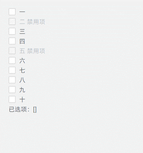
lists: [
{key: 1, name: "一"},
{key: 2, name: "二 禁用项", disabled: true},
{key: 3, name: "三"},
{key: 4, name: "四"},
{key: 5, name: "五 禁用项", disabled: true},
{key: 6, name: "六"},
{key: 7, name: "七"},
{key: 8, name: "八"},
{key: 9, name: "九"},
{key: 10, name: "十"}
],
// 已选择项
selected: [],
// 预选择项
readySelected: [],
// 起始支点
pivot: undefined
}
},
methods: {
/**
* 选择触发
* @param {Object} record 当前选择的值
*/
onChange(record, e) {
console.log(e)
const { pivot, lists, selected } = this;
// 当前勾选状态
const checked = e.target.checked;
// 当前事件操作状态
const nativeEvent = e.nativeEvent;
// 实际当前选择项位置
const realIndex = lists.findIndex(row => record === row);
// 是否满足 Shift触发多选
if (nativeEvent.shiftKey && pivot !== undefined && realIndex !== pivot) {
// 满足 触发 Shift 批量选择
// 计算 位置方向
const direction = Math.sign(pivot - realIndex);
// 计算 起始选择项位置 与 当前选择项位置 的距离差值
const dist = Math.abs(pivot - realIndex);
let step = 0;
while (step <= dist) {
// 计算当前循环选择的位置
const i = realIndex + step * direction;
step ++;
const row = lists[i];
// 跳过禁用项
if (!row.disabled) {
// 是否包含当前值
if (selected.includes(row)) {
// 取消勾选
if (!checked) {
this.selected = this.selected.filter(j => row !== j);
}
} else if (checked) {
// 勾选
this.selected.push(row);
}
}
}
// 赋值起始支点位置
this.pivot = realIndex;
} else {
// 不满足 触发 Shift 批量选择
// 普通选择操作
if (checked) {
// 勾选赋值
this.selected.push(record);
} else {
// 取消勾选赋值
this.selected = selected.filter(i => record !== i);
}
// 赋值起始支点位置
this.pivot = realIndex;
}
// 清空预选择项
this.readySelected = [];
},
/**
* 鼠标移出 预选择项 操作
*/
handleMouseleaveReadySelected() {
this.readySelected = [];
},
/**
* 鼠标移入 预选择项 操作
*/
handleMouseoverReadySelected(record){
const { pivot, lists } = this;
// 实际当前选择项位置
const realIndex = lists.findIndex(row => record === row);
if (pivot !== undefined && realIndex !== pivot) {
// 计算 位置方向
const direction = Math.sign(pivot - realIndex);
// 计算 起始选择项位置 与 当前选择项位置 的距离差值
const dist = Math.abs(pivot - realIndex);
let step = 0;
let temp_selected = [];
while (step <= dist) {
// 计算当前循环选择的位置
const i = realIndex + step * direction;
step ++;
const row = lists[i];
// 跳过禁用项
if (!row.disabled) {
// 是否包含当前值
if (!temp_selected.includes(row)) {
temp_selected.push(row);
}
}
}
// 赋值预选择项
this.readySelected = temp_selected;
}
}
}
}
</script>
<style scoped>
/* 预选择项 未选择样式 */
.ready-selected /deep/ .ant-checkbox .ant-checkbox-inner {
border: 1px solid #1890ff;
}
/* 预选择项 已选择样式 */
.ready-selected /deep/ .ant-checkbox-checked .ant-checkbox-inner {
background-color: #8cc0f1;
border: 1px solid #8cc0f1;
}
</style>
附相关
【2】https://github.com/TuSimple/naive-ui
 协议许可
协议许可
本文所有内容严禁任何形式的盗用
本文作者:Amos
本文链接:https://amoshk.top/2021090301/
 评论
评论